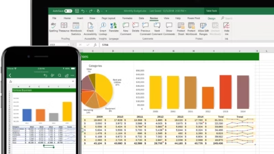
An Excel dashboard is a visual summary of your data—usually built with charts, tables, and filters that help you quickly understand key insights. Dashboards are useful for tracking performance, analyzing trends, and presenting data in a clean, interactive way.
Here’s how to create one from scratch, step by step.
1. Plan Your Dashboard Before You Start
Ask yourself:
- What is the goal of your dashboard?
- What data do you have?
- Who will use it, and what do they need to see?
Sketch a simple layout on paper. Decide what metrics or KPIs you want to include (e.g. total sales, average order size, top-performing products).
2. Prepare Your Data
Your data must be clean, consistent, and structured like a table. Store it on a separate sheet named something like RawData.
- Remove empty rows and columns
- Make sure each column has a header
- Avoid merged cells or inconsistent formats
Convert your data to an Excel Table:
- Select your data range
- Go to the Insert tab > click Table
- This makes it easier to reference and update
3. Create Summary Tables (Optional but Useful)
Use formulas like:
=SUM()=AVERAGE()=COUNTIF()=IF()=VLOOKUP()or=XLOOKUP()=FILTER()and=UNIQUE()(for dynamic ranges in Excel 365)
These summaries can be placed on a new sheet called DashboardData to keep the dashboard clean and flexible.
4. Add Charts and Visuals
Go to the Insert tab and choose:
- Bar/Column charts for comparisons
- Pie charts for composition
- Line charts for trends
- Pivot charts for grouped analysis
- Sparklines for mini inline trends
Place the charts neatly on a new sheet called Dashboard.
Use consistent colors and avoid clutter—each chart should answer a clear question.
5. Add Slicers or Filters (Interactivity)
To make your dashboard interactive:
- Use Pivot Tables and insert Slicers to filter by date, product, or region
- In Excel 365, you can also use drop-down lists with Data Validation to control chart inputs
These controls allow users to explore the data dynamically.
6. Format Your Dashboard
Keep it clean and readable:
- Use large, bold text for titles and key figures
- Hide gridlines and headers (View tab > uncheck Gridlines)
- Align all charts and visuals
- Use consistent font sizes and colors
- Add data labels where appropriate
You can also group charts and use shapes or backgrounds to section different parts of the dashboard visually.
7. Test and Share
- Try changing filters to make sure the charts update
- Check for any formula errors or broken links
- Save the file and share it as read-only or as a PDF
If you’re using OneDrive or SharePoint, you can also collaborate in real time.
Bonus: Use Templates or Power BI Later
Once you master Excel dashboards, you can:
- Start using Excel templates from Microsoft or third parties
- Learn Power BI, which is designed for more advanced dashboards with richer visuals and data connections

